This guide covers:
- Emails (beta)
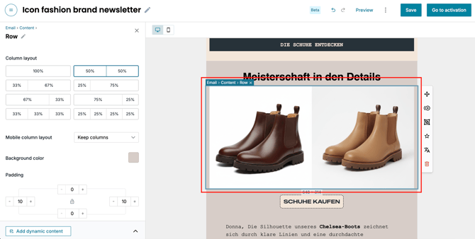
1. Select your content
Click on the block or element you want to adjust (e.g., a large banner, a text block, or whole product row).
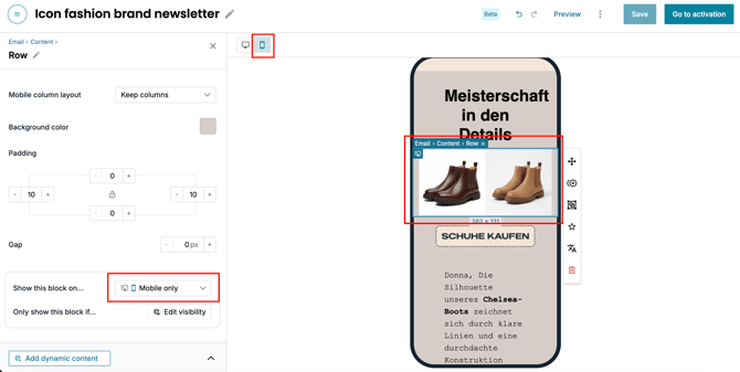
2. Choose the device visibility
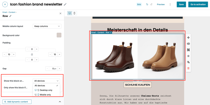
In the left-side menu for your selected block, look for the Show this block on… section. You will see three options:
- All devices: The content is visible on any device.
- Desktop only: The content will be hidden automatically on mobile (small screens).
- Mobile Only: The content will only appear on mobile devices.
3. Pro-tip: The "device swap"
To create a truly professional design, you can "stack" two versions of the same content. For example:
- Add a wide version of an image and set it to Desktop only.
- Directly underneath it, add a tall/cropped version of that same image and set it to Mobile only.
- The result: Desktop users see the wide view, and mobile users see the tall view.
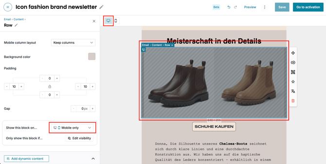
4. Preview your design
Use the Desktop / Mobile view buttons at the top of the Custobar editor to switch between the Desktop and Mobile icons. Confirm that your content appears and disappears exactly as you intended.
This example row is supposed to show only on mobile, so it’s shaded in the desktop view:
And in the mobile view, the same content shows normally: